CREATIVE BRANDING SOLUTIONS
PACKAGING • MORE THAN A MOUTHFUL CONSERVES
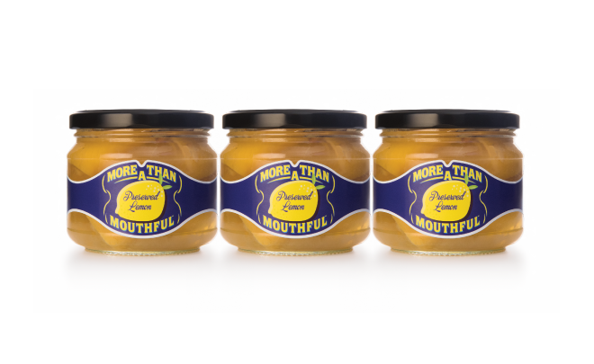
More than a Mouthful create a range of sauces and conserves that are based on traditional Italian recipes.
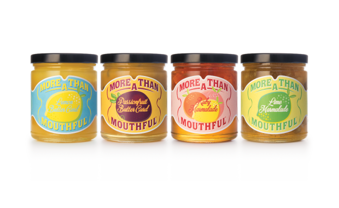
The playful name is carried out in a colourful and playful way.
With such a long name, we developed a structure that displays the product name at the heart as the hero.
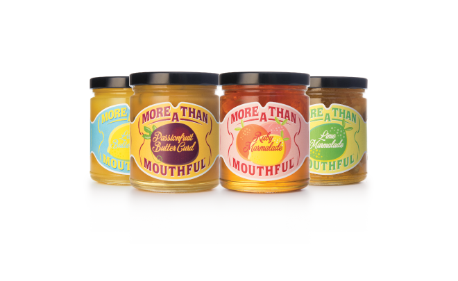
The label shape also gives a hint to a mouth and the large graphic illustrations shows that there's more of the products in these jars.
There are five conserves in the range, each a colourful label that differentiaites its flavour through the graphic illustrations and colour coding.
SCOPE OF PROJECT
• Branding
• Label Design
• Illustrations
• Packaging Design
• Print Management


